Plastic crates aren't sexy.
I know. Shocking. But they matter, and my job was to make you look at one.
The assignment
They're important, especially with food. Next to corrugated cardboard, they're more sustainable, more durable, more efficient. None of which makes anyone want to stop on a page.
The first challenge showed up immediately: the client had a lot to say. Every feature, every spec, every proof point wanted in. To borrow from Vince Lombardi, copywriting is a game of inches, and the whole job was deciding which inches to fight for.
The plan
Three rules, and everything else got cut to serve them.
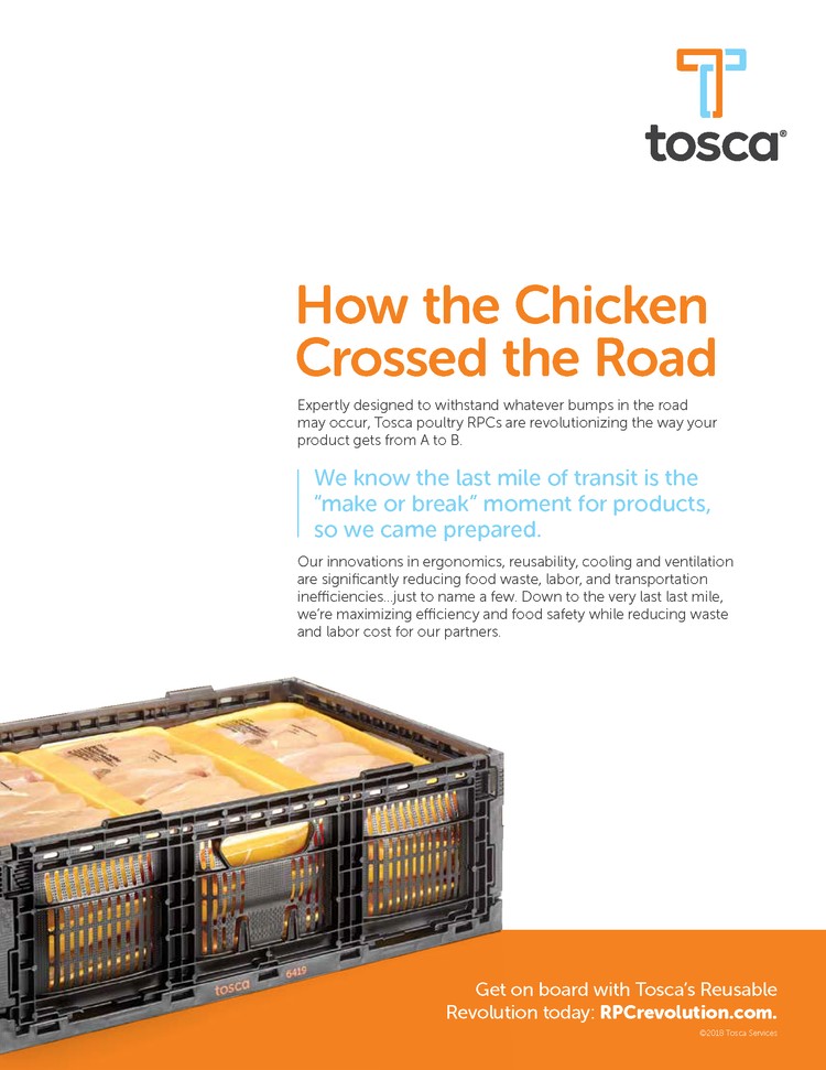
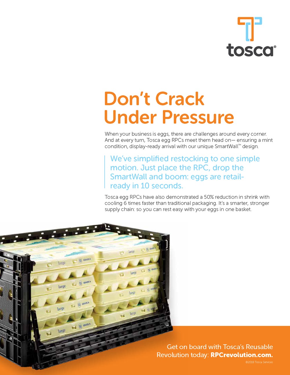
Grab with the headline. Stand out from every stodgy ad in the trade. So a poultry crate became "How the Chicken Crossed the Road," and an egg crate became "Don't Crack Under Pressure."
Use the negative space. The product is the crate. Let it breathe instead of burying it in copy.
Keep the eye moving in order. Headline, then the one idea that matters, then the crate, then the ask. A hierarchy, not a pile.

Why it's here
Sometimes, no matter how many hills you pick to die on, the client bullies everything they want onto the page anyway. You don't win, but it doesn't excuse you from making the copy land.
So we used blue callouts to carry the one point that had to get through, and we still built the eye a path: Tosca, then the headline, then the crate. A diagonal scan. And if we're lucky, they double back to the copy. Do that with a plastic crate and you can do it with anything.