The barbecue aisle is packed. Good.
Dickey's was taking its signature sauces to retail. The shelf was already packed. The label had to earn a look before anyone read a word.
The shelf
Dickey's Barbecue Pit was ready to make the jump to retail with a line of signature sauces. The barbecue aisle is already packed to the rafters. The label had to earn its place on a shelf that crowded.
My team was tasked with designing a family of labels. Like most packaged goods, that meant clearing a pile of regulatory and legal hurdles before a single one could print.
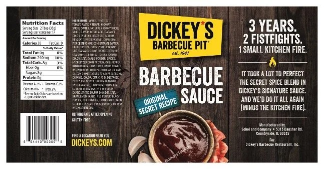
3 Years. 2 Fistfights. 1 Small Kitchen Fire.
That's the back-panel headline. The product had a story, so the label told it instead of listing features. When the eye finally landed on the copy, there was a pulse waiting for it.
A visual spellcheck
A label on a crowded shelf has one job before it has any other: get seen.
So we didn't just design for taste. We tested where the eye actually goes, using Visual Attention Software.
It doesn't know good design. It knows where the eyes will likely go. First it builds a heat map of the design, showing where attention lands.
Then it maps the gaze sequence: the four most-likely gaze locations, in the order a shopper is most likely to hit them. That's what the numbers on these are. Not decoration, a viewing order.
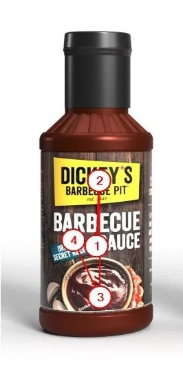
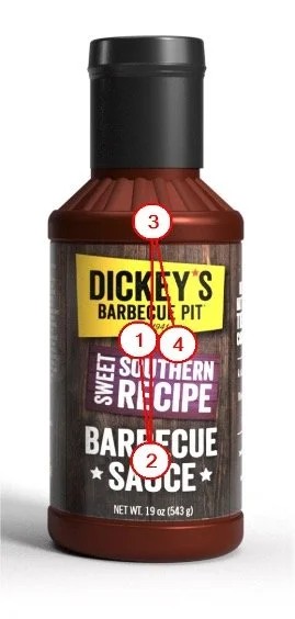
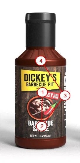
What we were after: first gaze on the Dickey's logo, then the product name and flavor, and the food shot last. That order was deliberate. Sauce looks like sauce, the spicy and the original read nearly identical on a shelf, so the appetite image was the least of the job. Get them to the brand and the flavor first, and the picture can close.
The point
Data doesn't make an idea braver. It makes a brave idea easier to say "yes" to.
That's the whole use of it: not to replace the call, but to back it up when someone across the table needs a reason beyond "trust me."